Walking Through a Land
I’d like to divert our discussion today to talk about an aspect of themed design that we can’t use in Silver Antlers but is still an exciting and fascinating concept. A walk-through (or a dark ride) is meant to be experienced in exactly one way—even if there isn’t a plot in the sense we expect from a narrative work, there’s still a beginning, middle, and end to these things. But take a step back to the design of a collection of attractions and we’re building a land.
Compare “it’s a small world” to Fantasyland: the former is a single line (however much it may twist and turn) while the latter is a varied space, with many destinations that can be experienced or avoided at will. (I hope you never choose to avoid “small world.”) A land is built for wandering, and while it may also tell a story, it’s the kind of story that is definitely more felt than read: “Small world” suggests an idea but Fantasyland suggests a mood. It creates expectations in its audience so as to enhance whatever experience its individual attractions aim to share.
Lands can also be fractal: Fantasyland is part of the Magic Kingdom, which is part of Walt Disney World, and similar concepts are applied at different scales in each. We can think about the city of Lake Buena Vista as a land, too: it’s not as coherent as the others, because many more disconnected parties were involved in its design, but land design is not unlike urban planning.
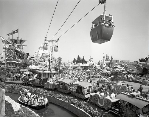
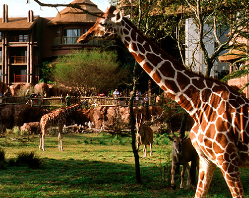
The Magic Kingdom is designed as a hub. There’s a large single entrance point: through the turnstiles, under the railroad station, and onto Main Street USA. But as we walk down Main Street toward Cinderella’s Castle1, the path branches off in many directions, toward Adventureland on the left, Tomorrowland on the right, and over the drawbridge to the other lands. Adjacent lands connect to each other as well, but they all stretch outward from the castle—spokes from the hub. The design was revolutionary when it was used to build Disneyland, and almost all of the Disney parks have used it since then. It’s a pattern that gently guides an audience from one destination to the next while helping them to maintain their sense of place. It also lends itself to subtle transitions, as the different lands tend toward equal proportions and repetition. I’ll refer you again to FoxxFur’s study of all of the lights in the Magic Kingdom for examples of how elegantly these lands can interact.
Speaking of Ms. Fur, let’s contrast the hub-and-spoke to the simple wheel design of World Showcase, the travelogue upper half of EPCOT at Walt Disney World. In Taking Apart World Showcase, she explains how the EPCOT planners made a very different decision in land design to great effect:
But the most exciting innovation is that all of these pavilions must be passed in order to get all the way around the lagoon: the hub concept for Disneyland, there a revolutionary gesture of convenience, here becomes a solid lake where once there was only a circular moat and links all of the civilizations to the original water from which they emerged from. The hub of Disneyland which offered both inclusion and exclusion (a spectator could visit Disneyland and never once enter Tomorrowland, for example) now is a wheel uniting all cultures in location in the geometric pattern of the globe they all share, a globe which is also the master layout of the sister area Future World and the icon of the collective entity known as EPCOT which they embody.
The important idea here is considering a land not just as a collection of attractions, but as an experience in itself. And land design can take cues from attraction design, as well: a land is experienced subliminally, but also slowly, and so there are plenty of opportunities to introduce elements of a story. Here’s FoxxFur in that same article explaining “false portals” (I told you we’d be referencing her research a lot):
A false portal can be a window, door, or any opening placed in any such way to suggest that any given themed space continues beyond where in reality it will stop [immediately] out of sight. Throughout Disney parks there are false doors, false windows, false caves, false skylights, false rivers, false balconies, and practically anything which can be reasonably built to suggest that regular human activity is going on in the theme park, one of the least accommodating areas for regular human activity ever devised. The spectator isn’t trained to look at the theme environment as being built for the express purpose of selling an idea to them; they look at it as they would any real life environment where things are where they are because that’s where they were built, and as a result the aim of Stratification is achieved subliminally.
(“Stratification” used in the context of themed design essentially means the act of creating a believably natural environment. Read more about Stratification versus Presentationalism in Elements of Theme Design, an article whose author should be obvious by now.)
So a land is, at least in its most popular form, a collection of attractions arranged deliberately to complement each other, as well as the spaces used to move between them, all of which attempt to imply a consistent universe. And I use the term “attraction” very loosely.
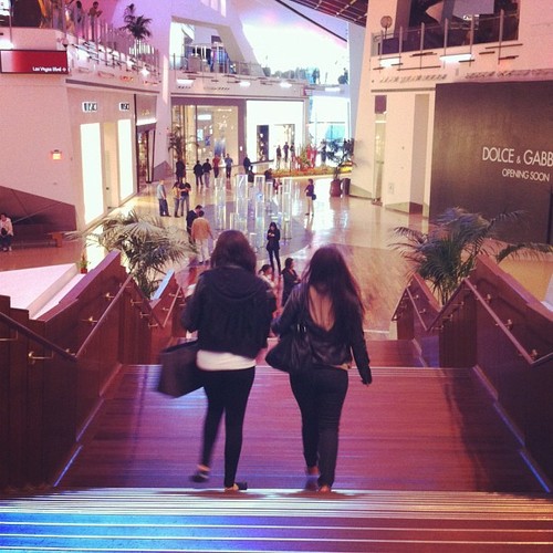
CityCenter is a huge complex that opened in Las Vegas a few years ago. It’s one of the most ambitious projects on the Strip. A hotel and casino, another hotel or two, some condominium towers, and Crystals, a shopping mall. Maybe my favorite shopping mall ever. Its layout is nothing like Disneyland—the map looks pretty similar to any mall’s map—but the level of detail is astounding. Each storefront was carefully and specifically designed to complement and coordinate with the retailer it represents, from the materials and lights used in its façade right down to the style of its doors. The stores tend to jar and there’s no sense that Crystals is, say, a town square inhabited by local residents2, but the contrast is very pleasing and there’s a sense of consistency despite its lack of sameness. If you’re looking for an application of themed design outside of experimental theater, you’ve got it here.
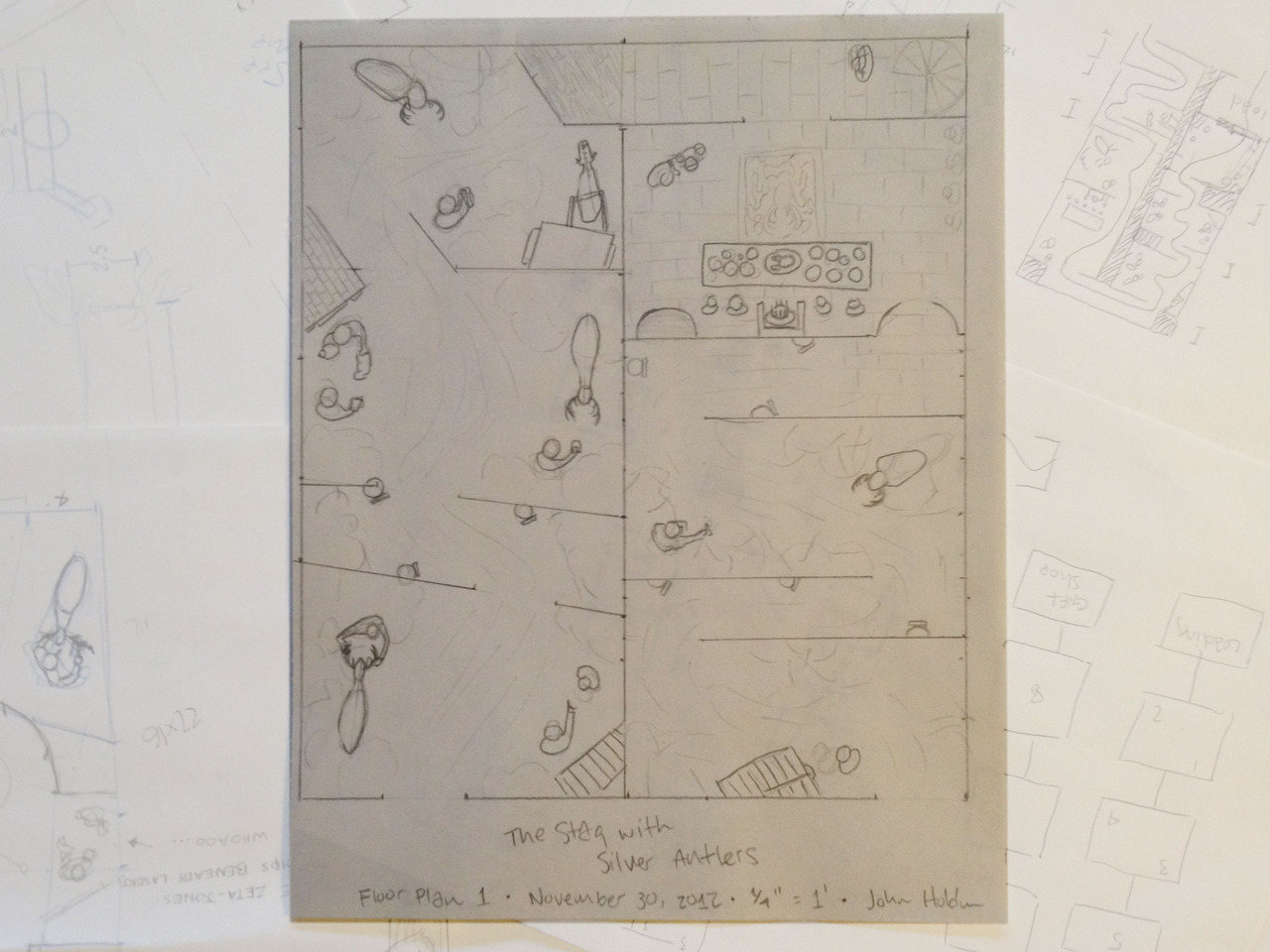
I want to use all of these ideas but they’re just too big for Silver Antlers. I plan to add some false portals and little tricks like forced perspective3 into the castle scene, but I’m thinking about ways to incorporate these strategies into our next project in a bigger way. Do you happen to know someone who’s building a mall?
-
The castle serves Main Street as what Walt called a weenie: a large focal point in the distance that draws an audience onward to a specific destination. ↩︎
-
Crystals is definitely Presentational. Again, see Elements of Theme Design. ↩︎
-
A common example of forced perspective is designing an inaccessible second story of a show building at less than life scale, so the structure seems larger than it really is. Disney parks are overflowing with these touches, which integrate naturally with false portals and things like fake staircases, to create the illusion that an environment is busier and larger than it really is. This flavor of misdirection is all over Las Vegas, too—casinos avoid straight sightlines so their inhabitants always feel like there’s something more to see just around the bend. ↩︎